Wednesday, August 31, 2016
The Fixer Upper House: A Spruce Up For The Guest Room
My husband used to refer to our guest room as the Granny room.
Ouch.
He had a point. It was the hodgepodge room of our house, with a few elements thrown together that never made for a cohesive whole.
A twin bed and quilt from the last house's guest room, thrown together with another twin bed and another quilt that didn't match.
A little pumpkin orange, some aqua, some red, some black. Like I said, it was a hodgepodge. If I could have found another pumpkin quilt or black quilt to match (originally from Walmart's Better Homes and Gardens collection), I would have made it work. Alas, they were no longer available.
Time to go with a new color scheme.
After careful consideration and extensive scientific methods, we picked a paint color for the new room. Sherwin Williams Watery...because we already had a gallon left over from when we painted the dining room last year. Use what you have, right?
Ed painted the room last weekend, and I did the spruce up. Here it is!
Wow! Now that's a big improvement!
I should also add that this was a top down renovation. New windows, new trim, and a new ceiling fan where there was once a dismal light fixture.
The bedding and duvet covers are from IKEA. I love the coral/pinkish/salmon color paired with the blue. This room is a little more feminine in nature, I will admit. But when you live in a house of men, you have to mix the masculine with the feminine. The coastal color palette of this house, paired with the woodwork, is a little more masculine. I try to balance that with a good dose of floral and pattern, as I did here.
There were a few existing elements that were red in this room, so I used this palette to tie them together. The red night stand from my mother is one of them.
And this little red child's chair and desk were from my husband when he was a boy.
I found the perfect spot for my new vintage tole tray. Eventually I will get it hung on this wall above the desk, but for now it works. I did have to buy some new lamp shades from Walmart, but I think it works much better now. Clean and simple.
The wall over the beds needed something to tie it all together. I decided to use what I already had to create a gallery wall. An old vintage oil painting paired with some of my Alfred Meakin china plates. Love it!
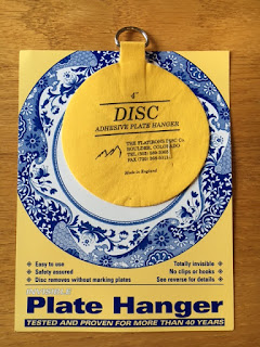
I purchased these disc hangers (made in England) from Hobby Lobby, and they work great for hanging dishes on walls without all the bulky metal hardware.
This is the smallest bedroom in the house, but now it feels so much bigger and more expansive with this lighter brighter color. In terms of real estate, I often like to paint the smallest bedroom in a color that would make a great nursery for a potential buyer. I even staged a room as a nursery once using Sam's old crib, a hutch, and a few carefully placed toys and stuffed animals from storage.
Another project crossed off the list! And just in time, too! Family is coming to visit us for this Labor Day weekend, and now I will have a pretty place for them to stay.
Thanks for visiting the cafe today!
Subscribe to:
Post Comments (Atom)


So pretty and your color choices remind me of a favorite color combination used on a few cards! Have a wonderful Labor Day rest!
ReplyDeleteLove the guest room spruce up and the blue looks great in there. I don't blame you for wanting a girly room in a house full of boys but really it's not that girly. I'm off to look for those plate disc because I have some hung on those awful plate holders that I'd love to replace. Thanks for sharing that idea.
ReplyDelete